Product Design

Thrive Health

My Role
Lead Designer
Timeline
10/2021-02/2022
A picture showing various screens from the thrive app.

Overview

The problem

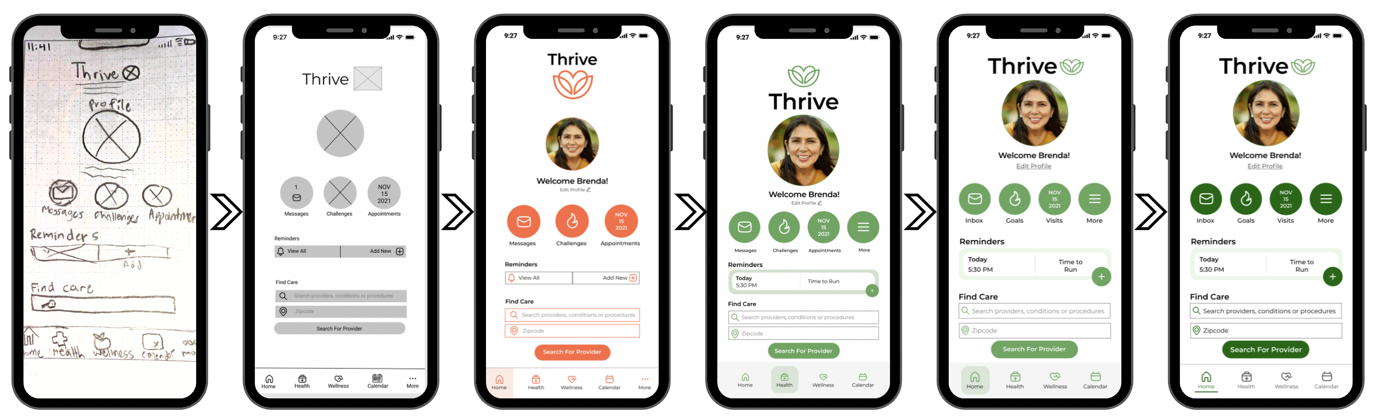
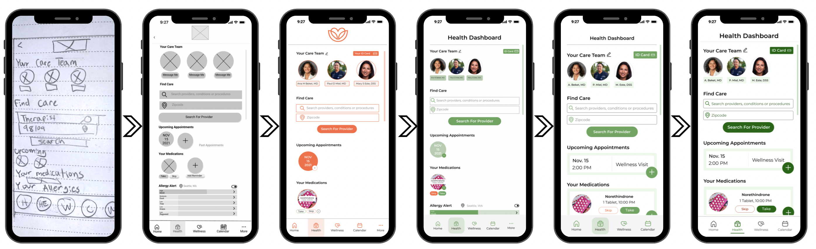
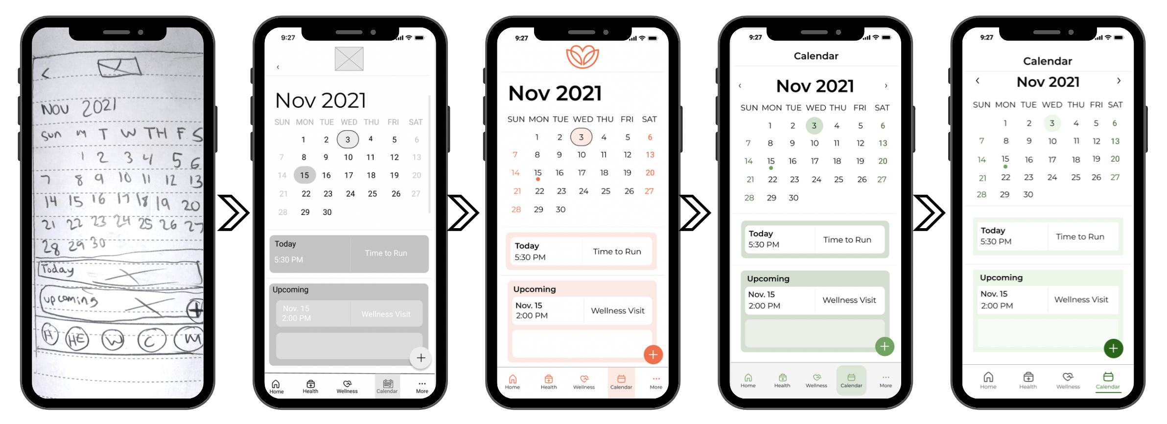
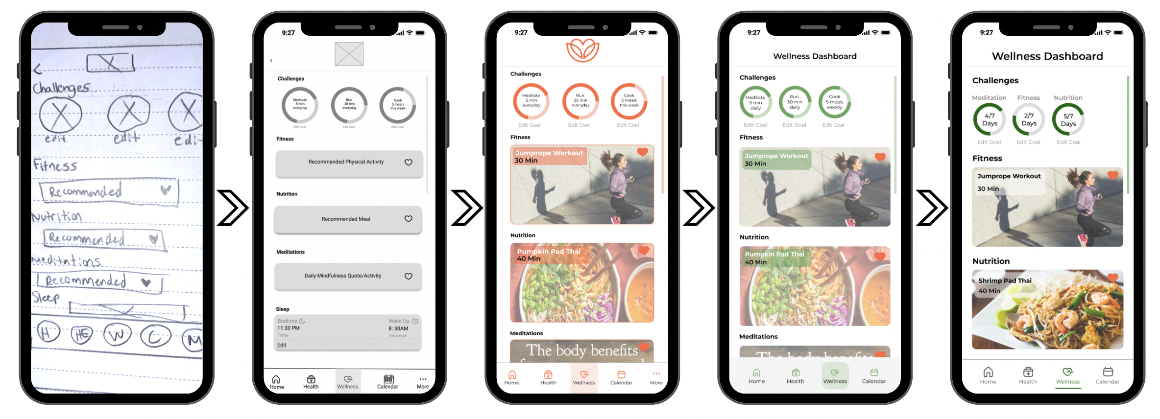
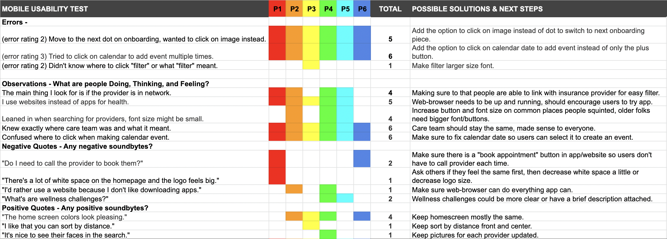
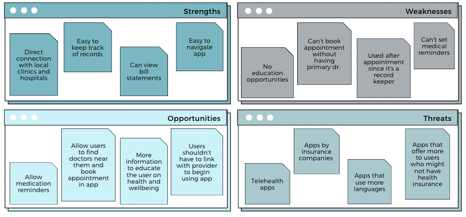
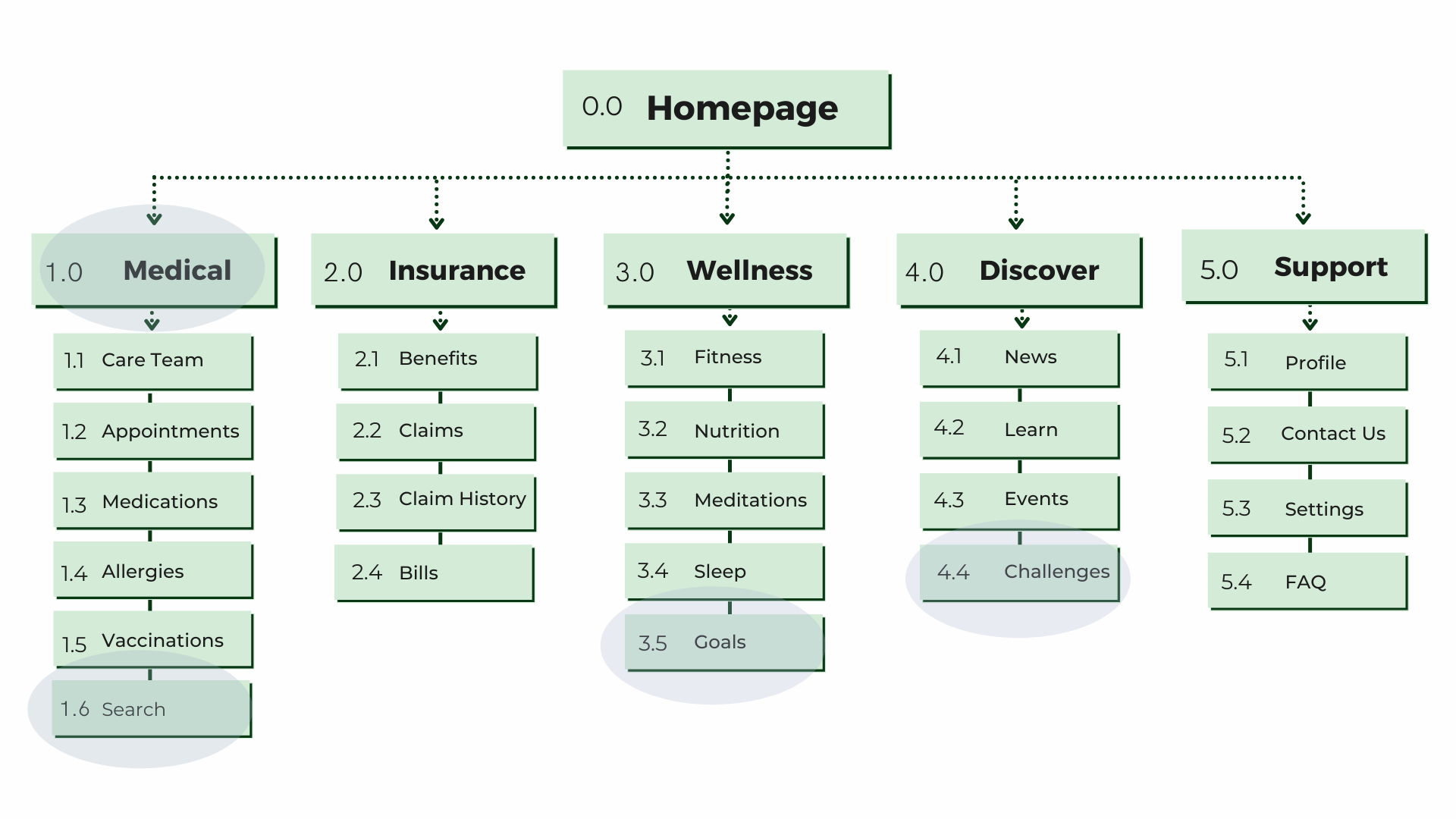
Health-conscious individuals need an easy way to access health information in one place because they find it hard to manage all their paperwork and appointments.

The solution

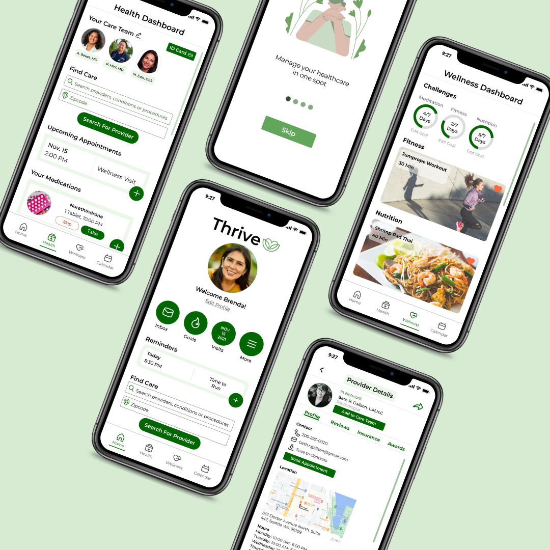
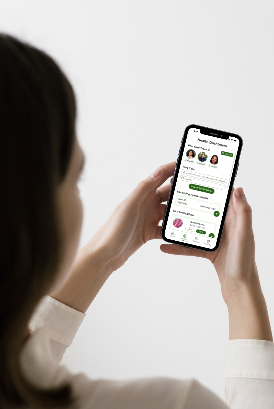
Thrive users can access all their relevant health information through the app and schedule appointments with medical professionals and their care team.

Picture showing someone holding a phone with the Thrive app design.

Design Toolkit

Figma
Usability Hub
Canva
Gimp 2.10
Optimal Workshop

Discover Phase

The first phase of my design thinking process is to discover as much about the task as possible. I start every project focusing on understanding the root problem, the market I am competing in, and who my users are. This thorough research in the beginning helps to form a strong base which in the end will save my team time, money, and resources.

Competitive Analysis

#1: WebMD

The WebMD app's homescreen, shows articles and their main features.
Key Objectives
Swot Analysis

#2: FollowMyHealth

The app FollowMyHealth's sign in screen.
Key Objectives
SWOT Analysis
SWOT analysis of FollowMyHealth

User Research

Once I was able to identify the competition's strengths and weaknesses, opportunities for a new app emerged that could fill the gap in the market. In order to center my future users in the discussion, I conducted five user interviews with a wide range of age groups and income levels. Each interview lasted 20 minutes and the age range was between 21-60 years old.

Interview Questions
Interview questions I asked users: 
 1. Can you tell me about yourself and what a typical day looks like for you? 
2. When you hear the terms health and wellness, what do you think of? 3. How often to you think about your health? 4. Do you have a primary care doctor? If yes, how did you find them? If no, why? 5. Where do you learn about health from? 6. Do you have a regular health check up each year? If so, how do you schedule them? If not, why? 7. When you think about going to the doctors, what emotions come up? Why? 8. Are you responsible for managing anyone else's health, other than your own? 9. Do you take regular medications? If so, how do you remember when to take it? 10. When you think about managing your health, do you have any concerns? If so, can you elaborate on them? 11. How do you make appointments for a doctor visit? 12. How do you typically search for a doctor or health care appointment?  13. Do you currently use any health apps right now? If so, what? 14. How do track your health information right now? 15. Do you prefer having to view advertisements for a free app or pay a fee for an advertisement free app?
Affinity Mapping
Notable quotes from the interview data were used in an affinity mapping session in order to identify common themes and feelings.
Affinity mapping quotes about medication, advertisements, feelings and reminders. Affinity mapping research, finding care provider, and apps.
Key Takeaways

Define Phase

After I had discovered the problem users were experiencing when managing their health and identified the gap in the market, I moved onto the define phase where I focused on understanding the user and redefining the problem. This phase helped me envision how Thrive might work to legitimately service users.

User Personas

After conducting user interviews, I created two personas who represent the user's needs, frustrations, and goals.

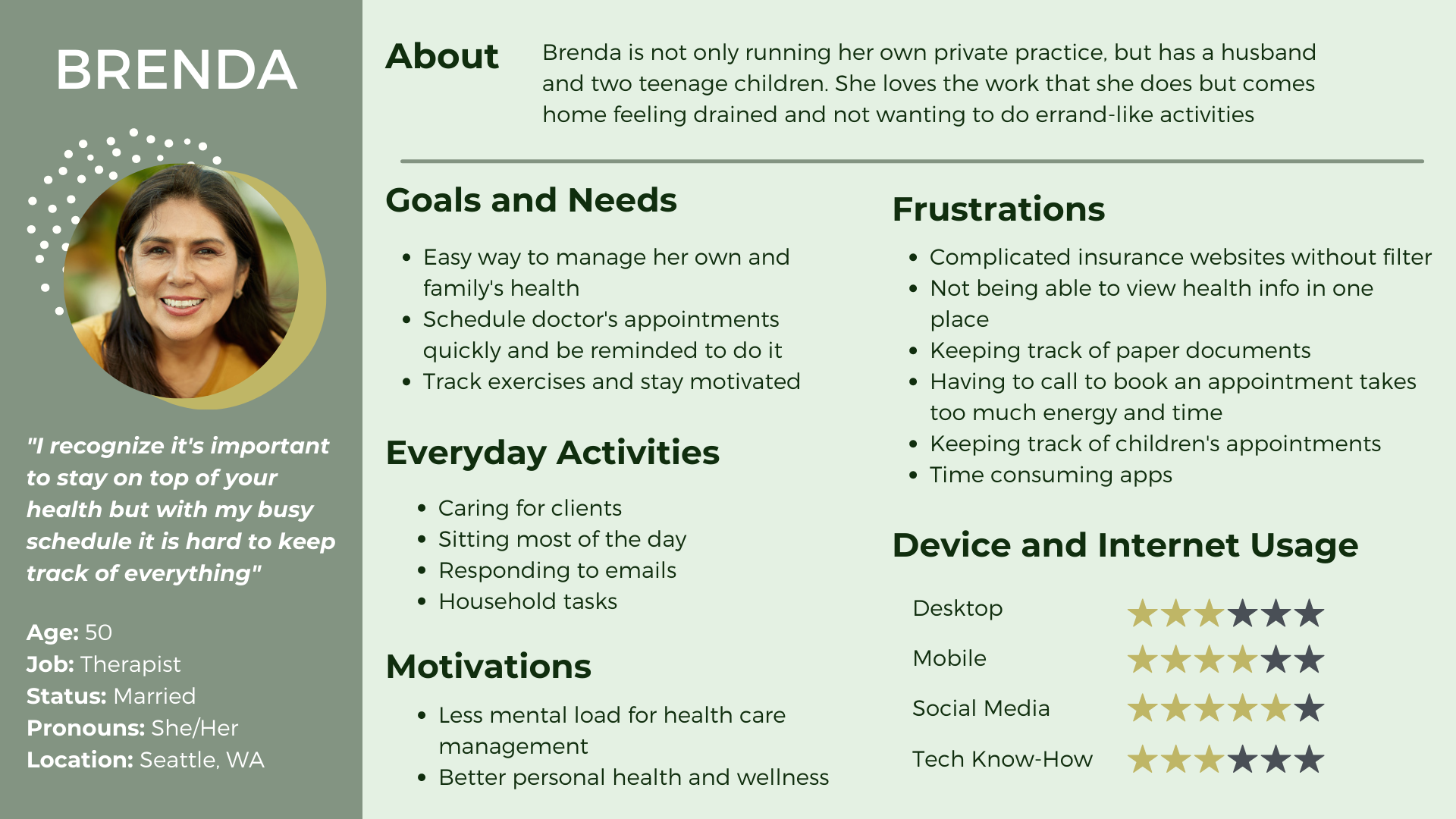
The first persona is Brenda who represents users who have family, a steady job, and are more focused on their health.

The second persona is Jack who represents younger users who are beginning to learn how to manage their healthcare.

Ideate Phase

Now that I understand who my users are and what the problem is, I'm ready to begin creating a solution.

User Flows

I wanted to practice empathy by putting myself into the shoes of the user. I thought to myself, how would Brenda create a profile? How would Jack book an appointment in the app? This led me to develop user-flows, two you can view below.

The user flow above demonstrates how users would create and save a profile.
The user flow above demonstrates how users would book an appointment in the app.

Card Sorting

After understanding the potential user flows, I began to construct the information architecture of Thrive. In an effort to center users throughout the design process, I used Optimal Workshop to conduct an unmoderated card sort session with 6 different potential users ages 21-60.
Old Sitemap
Old site map before card sorting. Major changes included goals, challenges,
New Sitemap
New sitemap after card sorting, changed medical to healthcare, search to find care, goals to challenges, and challenges to badges.

Prototype Phase

During the prototype phase, I created low and mid fidelity screens, the purpose was to create screens quickly in order to make mistakes and changes quickly.

Lofi-Hifi

HomePage
Home page iteration design improvement. Starts with sketch, goes to mid fi, 1st version of hi fi in red, 2nd version hi fi green, 3rd version hi fi additional white space, and last hi fi darker green for better contrast.
Health Dashboard
Health dashboard page iteration design improvement. Starts with sketch, goes to mid fi, 1st version of hi fi in red, 2nd version hi fi green, 3rd version hi fi additional white space and bigger buttons, and last hi fi darker green for better contrast.
Calendar
Calendar page iteration design improvement. Starts with sketch, goes to mid fi, 1st version of hi fi in red, 2nd version hi fi green, 3rd version hi fi additional white space, and last hi fi darker green for better contrast.
Wellness
Home page iteration design improvement. Starts with sketch, goes to mid fi, 1st version of hi fi in red, 2nd version hi fi green, 3rd version hi fi additional white space and bigger buttons, and last hi fi darker green for better contrast.

Evaluate

During the evaluation phase, I began to test my hypothesis: was my design offering a solution to the initial problem? I conducted in-person/remote moderated user testing and a preference test using Usability Hub. In addition, I consulted with other designers to gather feedback. Of course, the "final" version has room for improvement and additional user testing has led to fine-tuning the design further.

User Testing

I recorded the user testing so I was able to focus on  the users and pay attention to body language. I learned that all participants were able to the complete the tasks but I needed to improve the functionality and accessibility of the app for an even more seamless user experience.

Rainbow spreadsheet showcasing errors that users made during user testing. Most common mistake was clicking on calendar date to add event other than the plus button.

Deliverable

The last iteration of the prototype came after multiple rounds of user testing and feedback. You can access the Figma file below.  

View prototype
Let’s talk now!
A picture showing various screens from the thrive app.